


Ecommerce Website Design: 16 Best Examples and Practical Guidelines (2026)

A comprehensive list of eCommerce website design examples that will inspire you and attract more buyers. Top tips and best practices at your service!
A well-designed ecommerce website is your hardest-working salesperson: it builds trust, guides shoppers to the right product, and closes the sale around the clock. But great ecommerce design is rarely about looking pretty for its own sake. It’s about getting the right visitor to the right product quickly, earning enough trust for a first purchase, and removing friction at checkout.
This guide covers both sides. First, the ecommerce website design best practices and UI tips that move conversion. Then 16 of the best ecommerce website design examples worth studying, each with the platform, industry, and what makes it work.
There’s one angle most “best examples” lists skip: many of these brands don’t sell only on their own store. They sell across Amazon, eBay, Etsy, and other marketplaces too. So alongside each example, we flag the design decisions that matter when your storefront is just one of several sales channels. That’s where a multichannel tool like Sellbery fits in.
On this page:
- Ecommerce Website Design Best Practices
- Ecommerce UI Design Tips
- 16 Best Ecommerce Website Design Examples
- What the Best Ecommerce Websites Have in Common
- Designing for Multichannel Selling
- FAQ
Ecommerce Website Design Best Practices
Follow these rules and your visitors will have a smoother experience exploring your offering, which makes them far more likely to convert into buyers. If you’re starting from scratch or want a fully managed build, an experienced e-commerce web design company can handle the heavy lifting; if you’re tailoring a store to a specific market, local web design services in Madison are one example of a regional partner.
Six practices we’ll cover here:
- Pick a minimalist design
- Use color with intent
- Lead with images
- Show social proof early
- Establish a clear brand identity
- Optimize your product descriptions
1. Be a Minimalist
Minimalist ecommerce design encourages buyers to act. Strip out anything that distracts from the products on sale. The less clutter on a page, the easier it is for shoppers to notice (and buy) what you’re selling. Keeping the design clean is a core principle for studios like Excited agency.
Good ecommerce design also guides the eye. Use bold type, graphics, and photography to highlight what matters: price, warranty, key benefits. Keep a clear contact route visible so shoppers can reach you with questions before they hesitate.
2. Use Color With Intent
Color is one of the most powerful tools on an ecommerce site. Warm, high-contrast accents like red are widely used to draw attention to calls-to-action, while cooler tones like blue tend to signal trust and credibility. Major platforms lean on the psychology of color to nudge conversions.
The practical takeaway: build calm, trustworthy base tones, then reserve a single high-energy accent for the actions you most want shoppers to take. Test which accent works on your “Add to cart” and “Checkout” buttons rather than guessing.
3. Use More Images
The homepage is the first thing most shoppers see, and images do the heavy lifting. Strong visuals make a bigger impression than text alone and frame information in a way that’s easy to absorb.
Before choosing homepage imagery, ask yourself: What do I want the visitor to feel? What am I selling, and to whom? Clear answers lead to pictures that speak directly to your audience. Pair each key image with a short call-to-action (for example, “View all styles”) to keep momentum.
4. Include Social Proof
Most first-time visitors arrive cold, knowing little about your brand. Social proof, real reviews, ratings, media mentions, certifications, gives them a reason to trust you. Surface at least one trust signal before a shopper reaches any product, and they’re far more likely to buy.
5. Establish a Clear Brand Identity
Every ecommerce website has a brand identity: how people perceive your business from its name to how it looks and sounds. Pay close attention to it, since consistency across pages is what turns a first-time visitor into a repeat customer.
A few ways to strengthen it: develop a tagline and reinforce it across the site; choose readable fonts and stick to them; lean on imagery or video. To keep visuals and messaging consistent, some teams use an AI logo maker or a branding agency.
6. Optimize Your Product Descriptions
Having an online shop isn’t enough. You have to bring in new customers and keep them coming back, which means writing product descriptions and showcasing reviews that tell shoppers exactly what they’re getting before they buy.
That’s something you can hand off to Sellbery: optimize and sync your product descriptions across multiple sales channels from one place, so the same listing stays accurate everywhere it appears.
Ecommerce UI Design Tips
From the usability side, what matters is that your design gives visitors confidence in your brand and service. That confidence doesn’t come from a single A/B test; it comes from caring about every visitor who lands on your site.
Four UI guidelines that consistently pay off:
- Keep navigation simple and useful
- Make on-site search effortless
- Show the checkout process clearly
- Make load time fast
1. Keep Navigation Simple and Useful
Like a physical store, shoppers want to get in and out quickly. High-performing ecommerce homepages limit the main menu to roughly four to six items and push everything else to the footer or secondary menus.
Ask the hard questions: Does your menu really need more than a handful of options? Are users struggling to figure out where to go next? Adding a few frequently bought products or popular categories to the homepage helps guide visitors without overwhelming them.
2. Automate Your Search
On-site search is a make-or-break UI element, especially for stores with large catalogs. Predictive search, filters, and clear category logic let shoppers eliminate what they don’t want fast and zero in on what they do. The less time spent hunting, the more time spent buying.
3. Show the Checkout Process
A visible checkout flow helps shoppers see where they are and how much is left to go. Use step indicators (“1 of 3”) or a progress bar, and keep a cart icon in the navigation on every page that has purchase options.
A clear, trustworthy checkout prevents drop-off on the final stretch. Minimal form fields, guest checkout, and accelerated payment options like Shop Pay, Apple Pay, and Google Pay all reduce friction at the exact moment it costs you the most.
4. Make Load Time Fast
According to a Google study, 53% of mobile visitors abandon a page that takes longer than three seconds to load, and expectations only get stricter each year. A slow site quietly leaks the traffic you worked to earn. If you also sell through a mobile app, investing in professional mobile app design services keeps that experience just as fast.
To find and fix bottlenecks, measure first. Tools like the Nostra Website Speed Test show where your pages are heavy. Compress image and graphics files, limit requests, and keep page weight down: pages under one megabyte load far faster than those weighing 10–50 MB.
16 Best Ecommerce Website Design Examples
These 16 ecommerce website design examples span fashion, beauty, food, jewelry, accessories, and home goods, and they run on Shopify, Shopify Plus, Salesforce Commerce, and Adobe Commerce.
Notice how many of them sell across multiple channels, not just their own store.
1. Allbirds
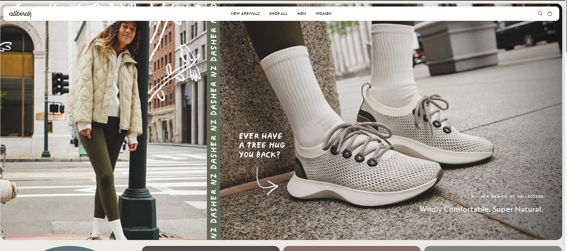
Platform: Shopify | Industry: Apparel
Allbirds isn’t afraid of the fold: its hero covers the full screen on any device. Navigation compensates well, with Men, Women, and Kids accessible above the fold so the right shopper reaches the right products fast.
What works: a clear audience split with “Shop men” / “Shop women” buttons; helpful conversion features on product pages (size chart, product videos, trust signals, verified reviews); a B Corp story and sustainability section that reinforce trust.
2. Death Wish Coffee
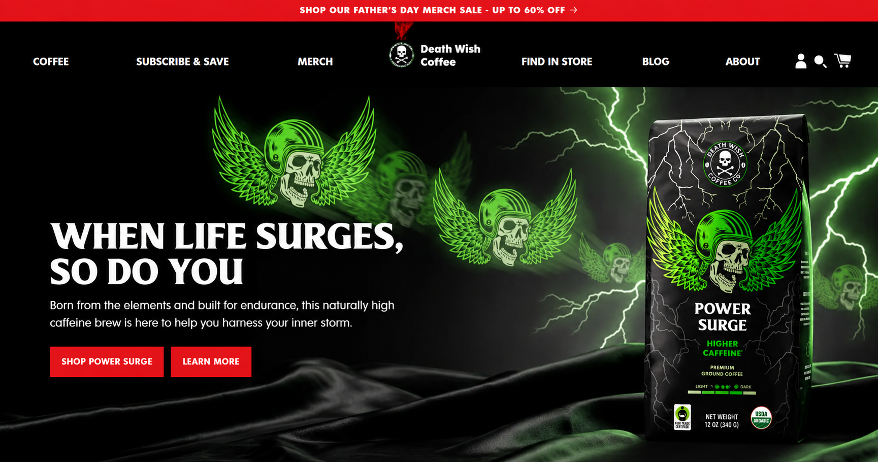
Platform: Shopify | Industry: Food and drink
Death Wish Coffee has a bold brand and isn’t afraid to show it. It claims to sell “the world’s strongest coffee,” and the heavy use of red makes you feel like you just drank a cup. The design knows exactly why people visit, so the first thing you see on scroll is the option to buy beans or cups.
Multichannel note: Death Wish sells heavily through Amazon as well as its own store. Keeping branding and product data consistent across both is what makes the experience feel like one brand, not two.
3. Kith
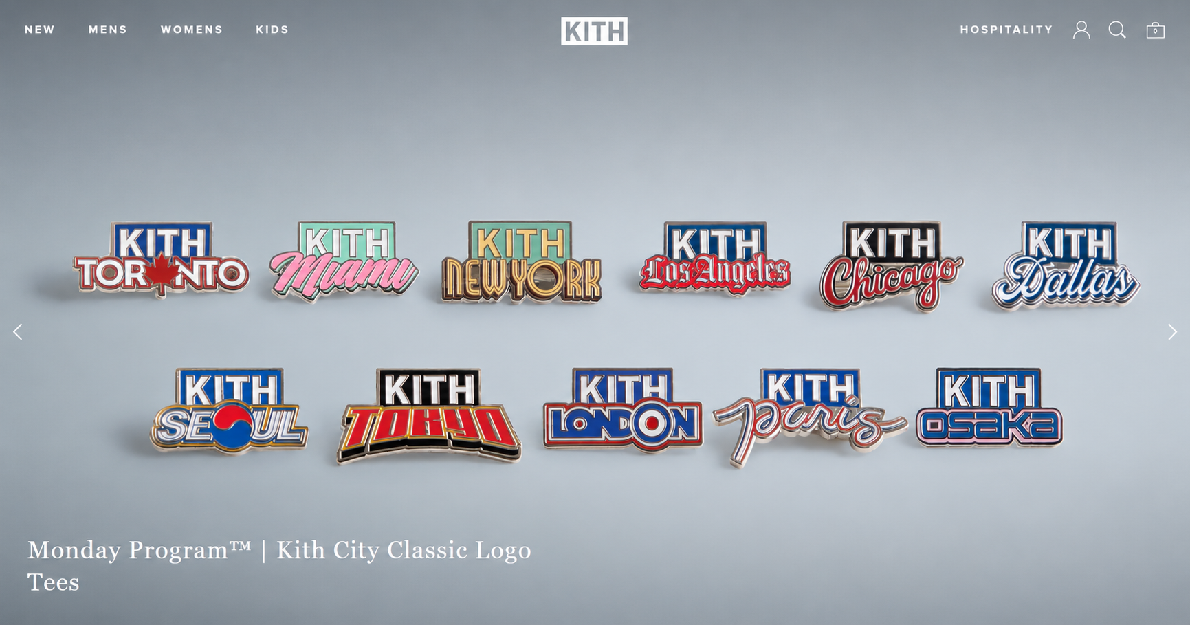
Platform: Shopify Plus | Industry: Fashion and accessories
Kith grabs attention the moment you land. The site feels clean yet sparks interest, with links to lookbooks, films, and journals.
The catalog is large, but product categories are organized so you can explore and find what you want quickly. Strong photography and typography carry the brand throughout.
4. MVMT
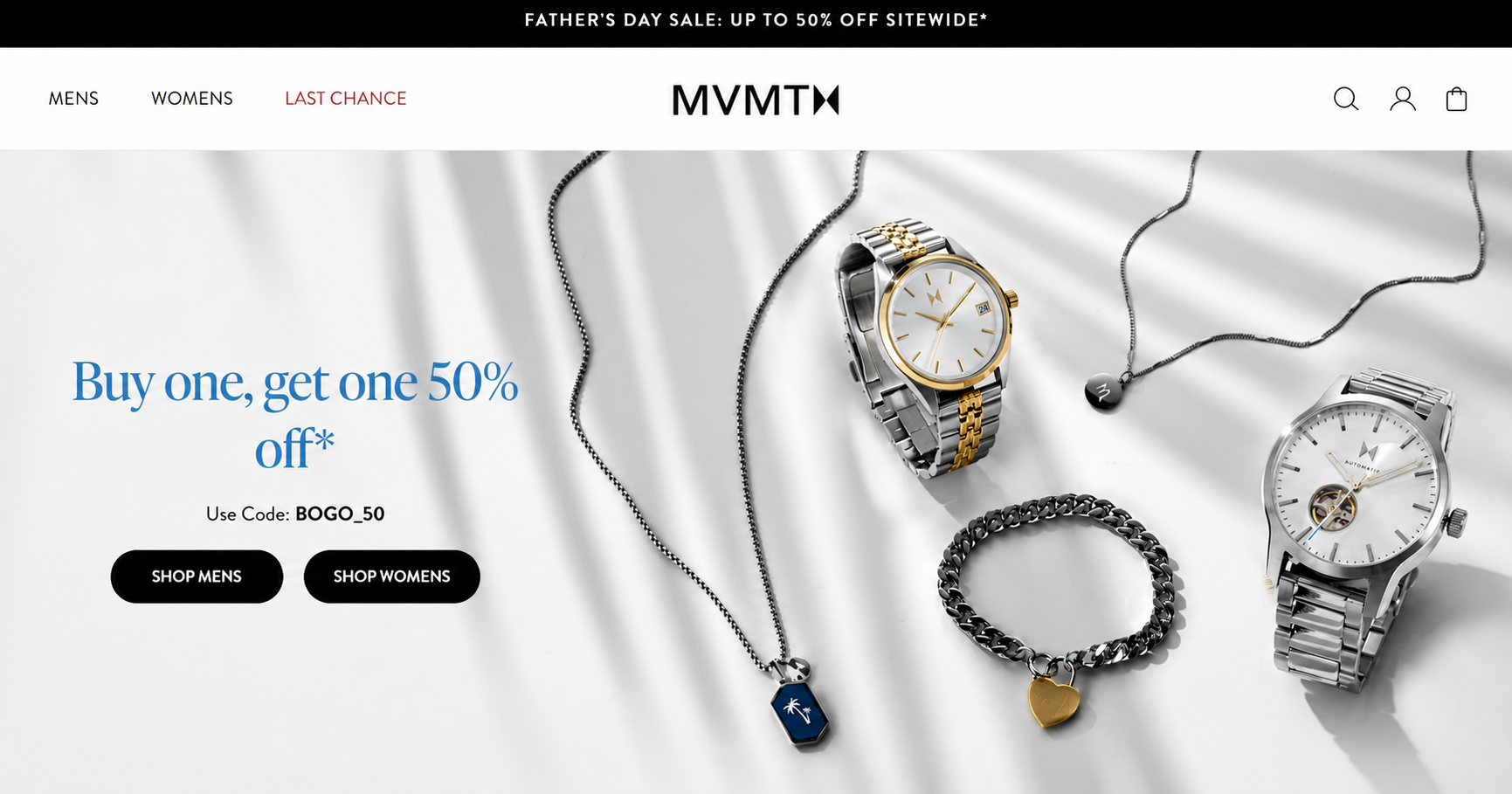
Platform: Shopify | Industry: Watches and accessories
MVMT‘s core value, “style shouldn’t break the bank,” runs through the design: sleek, sophisticated styling that showcases watches, eyewear, and jewelry at accessible prices.
Designer collaborations and a “Trending Now” section let shoppers check the latest designs at a glance.
5. Kylie Cosmetics
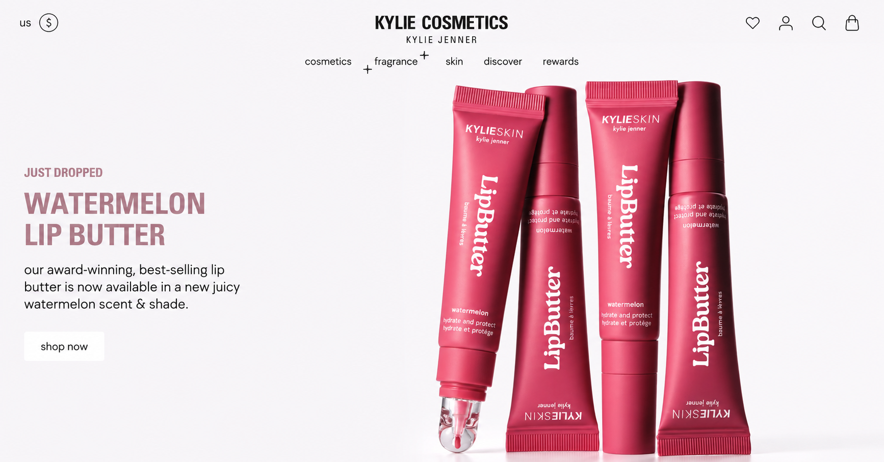
Platform: Shopify Plus | Industry: Beauty
As soon as you scroll, you see Kylie Jenner, a beauty icon for the target audience.
That endorsement gives the site an immediate trust and credibility boost. Products sit on clean backgrounds, and hovering over an image shows the product being used in action.
6. Beardbrand
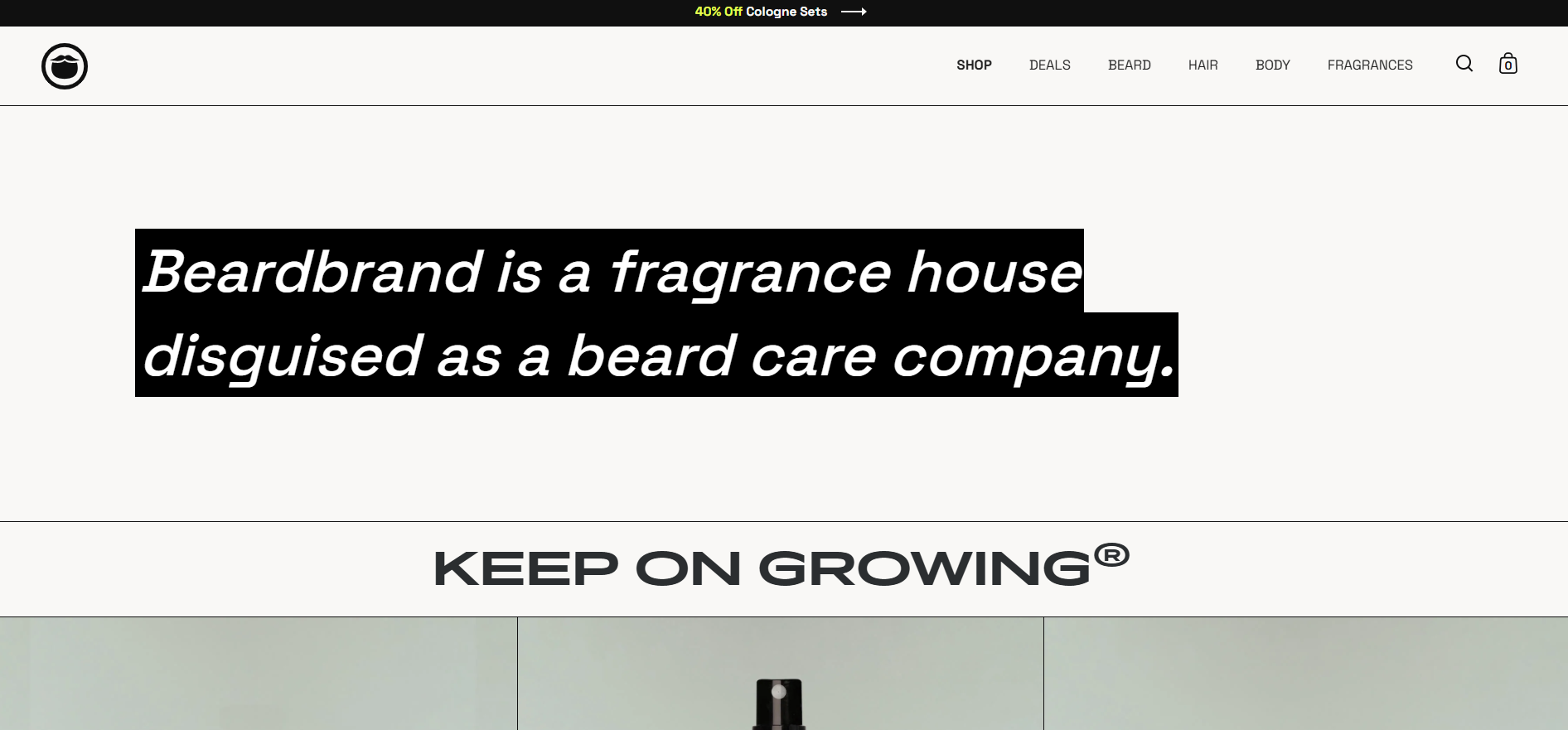
Platform: Shopify | Industry: Grooming
Beardbrand takes a content-heavy approach. A product-finder quiz, founder videos, and genuinely readable blog posts encourage you to stick around, engage with the brand, and buy.
It’s a strong reference for any store that wants to educate before it sells.
7. Pura Vida Bracelets
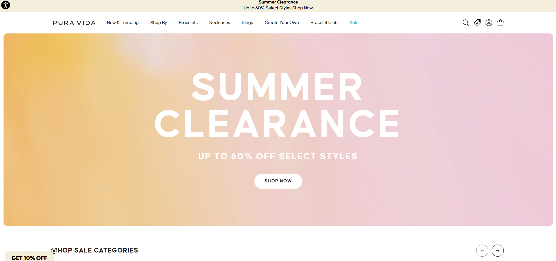
Platform: Shopify | Industry: Jewelry
To build trust, Pura Vida leans into the handmade, personalized nature of its products.
The homepage features multiple models, headings call out friendship and community, and reviews from thousands of customers scroll across the screen above media endorsements. It’s social proof done at scale.
8. Partake Foods
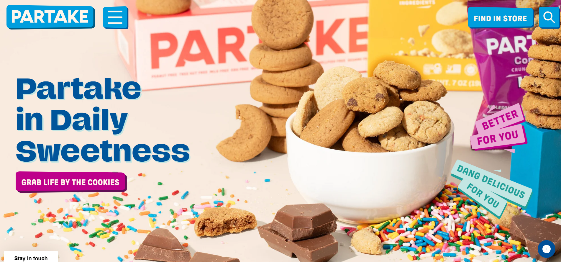
Platform: Shopify | Industry: Food and drink
Partake sells allergy-friendly cookies, and the design reassures right away with copy like “gluten-free,” “safe for school,” and “allergy friendly.”
The deal is sealed with press mentions, glowing reviews, and allergy-specific certifications in the footer. A model for trust-first design in a sensitive category.
9. Topo Designs
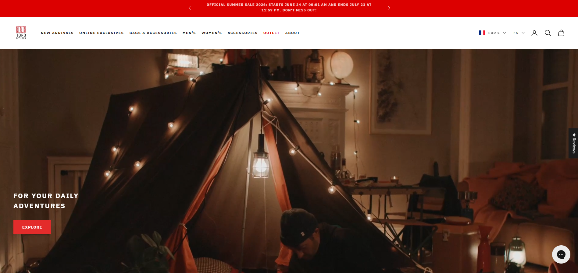
Platform: Shopify | Industry: Accessories and outerwear
Topo Designs uses imagery that resonates with its audience: products in exciting travel destinations, set against distinctive backgrounds that stand out from other outerwear brands.
It communicates sales clearly, incentivizes larger orders with free-shipping thresholds, and offers a newsletter perk to build community.
10. Ralph Lauren
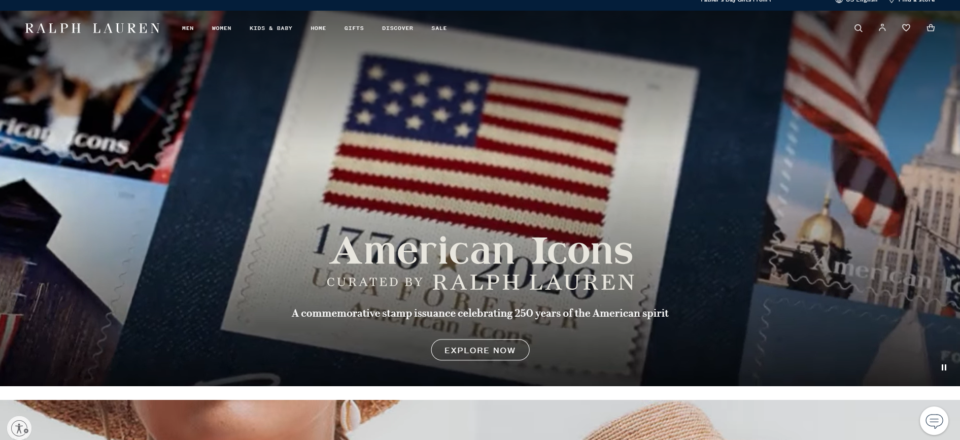
Platform: Salesforce Commerce | Industry: Fashion and home
Ralph Lauren is one of the best enterprise-scale retail designs.
The homepage gives shoppers something to buy right away, with sales often featured in the hero.
Impressive product photography and engaging elements (animations, video, sliders) carry the premium positioning.
11. Audemars Piguet
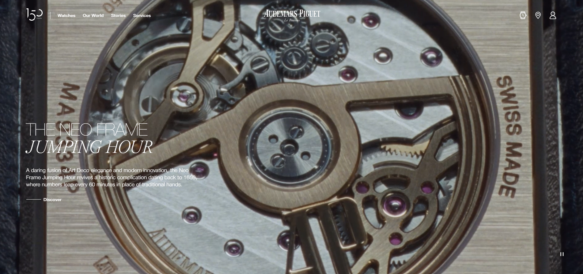
Platform: Adobe Commerce | Industry: Luxury watches
If you sell luxury, this is the reference. Audemars Piguet does an excellent job creating exclusivity, a must for high-end products.
Stunning close-up imagery, a clutter-free layout focused on the watches, and a rich navigation menu of categories, stores, and services all reinforce the prestige.
12. Hardgraft
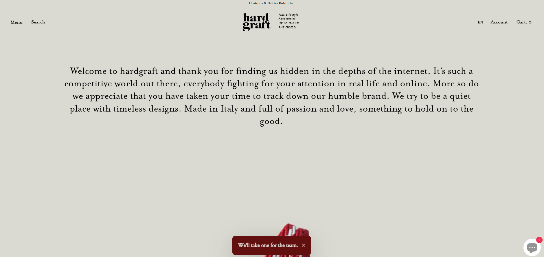
Platform: Shopify | Industry: Accessories
Hardgraft sells luxury lifestyle goods from Italy, and the design matches the branding beautifully.
Product photos with transparent backgrounds keep the site uncluttered, minimal light colors let elements stand out without harsh contrast, and product descriptions emphasize key words in larger fonts.
13. Recess
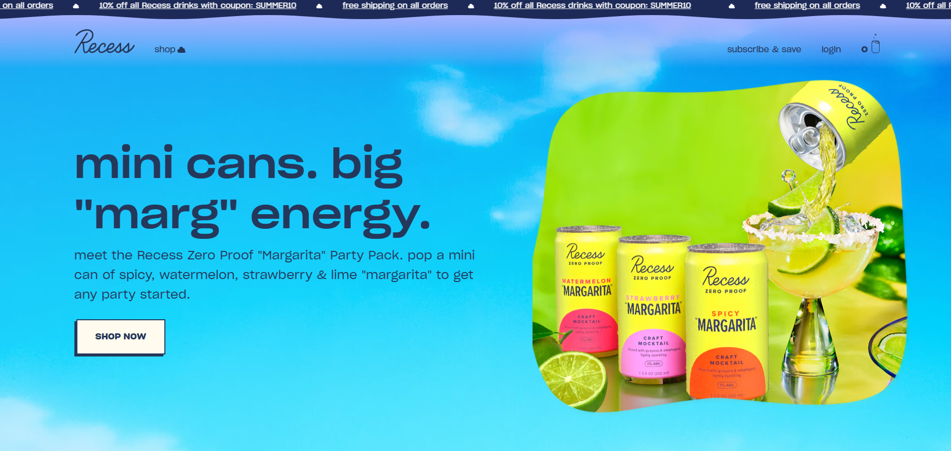
Platform: Shopify | Industry: Food, drink, and supplements
Recess is a great example of getting creative.
Animations, changing screens, and pastel colors evoke a calm, relaxing feeling, and the pastel backgrounds make the crisp product colors pop.
Customer reviews and press mentions sit on the homepage to back it all up.
14. Snif
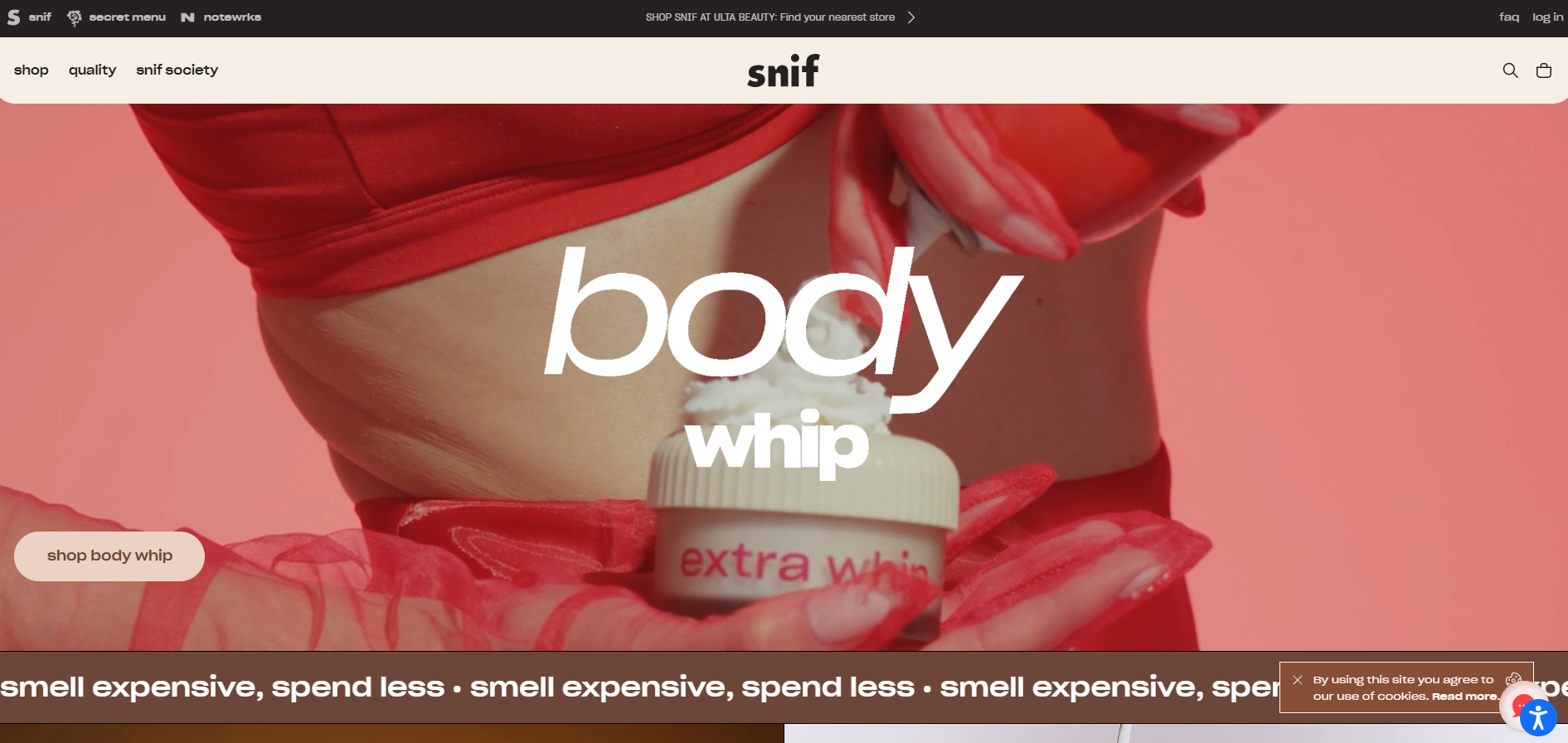
Platform: Shopify | Industry: Home goods
Snif captures attention with unique fonts, creative copy, and moving elements.
A bold palette of orange, peach, and cool tones makes the store stand out.
A “Build your own bundle” page lets shoppers try sample scents at a reduced price, turning product discovery into part of the fun.
15. Flaus
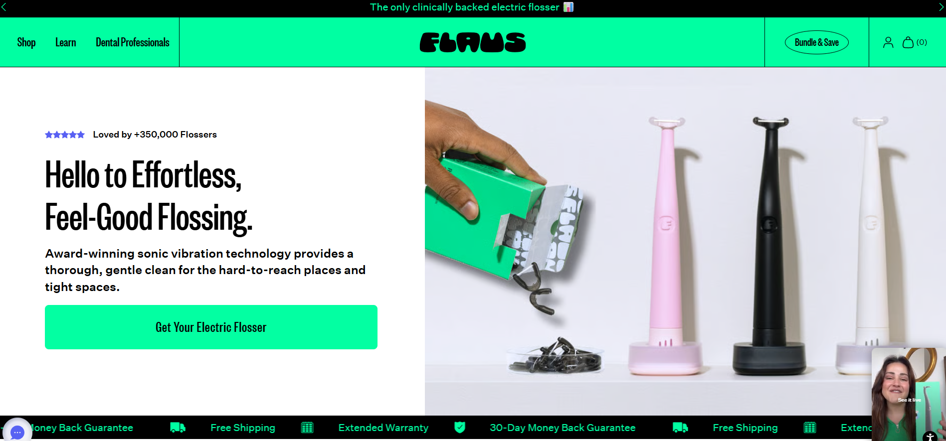
Platform: Shopify | Industry: Self-care
Flaus shows how a single-product brand can build trust around an innovative product (an electric flosser).
The value proposition and social proof, media mentions, sit front and center, product videos explain the benefits, and a dedicated “Dental Professionals” page recruits expert advocates.
16. East Fork
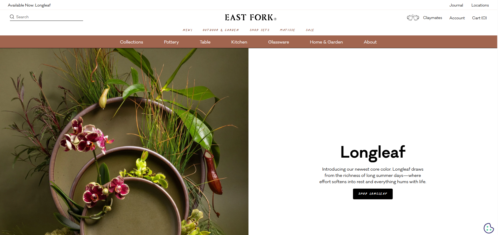
Platform: Shopify Plus | Industry: Home decorations
East Fork proves simple can be elegant.
Stunning product imagery and a sophisticated color theme create a harmonious experience, ample white space makes the pottery stand out, and a creative grid layout promotes different content types without clutter.
Want more inspiration? See the collection of 25 examples and 40 amazing eCommerce website design ideas.
What the Best Ecommerce Websites Have in Common
Across these 16 stores, spanning fashion, beauty, food, jewelry, accessories, and home, the same design decisions show up again and again in the ones that convert.
None of them are complicated.
| Pattern | What it looks like |
|---|---|
| Lifestyle photography over product-only shots | The product is shown being worn, used, lived with. White-background shots appear on product pages for detail, but they never lead. |
| Social proof within the first scroll | Media mentions, star ratings, or certifications surface before a single product. Flaus leads with press; Partake with certifications. |
| Reduced navigation, clear audience split | Main menus stay at four to six items. Allbirds splits Men / Women / Kids immediately; Kith keeps it tight. |
| Consistent brand personality on every page | Snif, Death Wish, and Beardbrand keep the same voice, color, and tone from homepage to cart. |
| Email capture as a core design decision | Not a popup bolted on as an afterthought. Topo Designs and others treat capture as a designed part of the experience. |
| Fast, simple checkout | Minimal form fields, guest checkout, and accelerated payments. Checkout gets the same care as the homepage. |
Designing for Multichannel Selling
Here’s what most “best examples” lists leave out: your website is usually just one of several places you sell. Many of the brands above also list on Amazon, eBay, Etsy, and other marketplaces, and that changes a few design priorities.
When the same product lives on your store and on three marketplaces, consistency becomes a design problem, not just an operational one. Titles, descriptions, images, and prices need to match so shoppers recognize the same brand wherever they find you. A mismatch erodes the trust your website design worked to build.
That’s the gap a multichannel tool fills. Regardless of which platform you build on, Sellbery lets you sync your Shopify, WooCommerce, Amazon, eBay, and Etsy listings and manage every channel from one place, so the polished experience on your own site carries through everywhere your products appear.
FAQ
1. What makes a good ecommerce website design?
A good ecommerce website design does three things well: it gets the right visitor to the right product quickly, it builds enough trust for a first-time visitor to buy, and it works on mobile without friction. Photography, typography, and color support those goals rather than existing for their own sake.
2. What are the most important elements of an ecommerce website?
Navigation, product photography, social proof, and checkout most directly affect conversion. Navigation decides whether visitors find what they want, photography decides whether they want it, social proof decides whether they trust you, and checkout decides whether they finish the purchase.
3. What is the best platform for ecommerce website design?
It depends on what you’re optimizing for. Shopify is the easiest to launch on and the most common among the stores here. Shopify Plus suits higher-volume brands, Adobe Commerce and Salesforce Commerce appear at enterprise scale. Platform choice matters less than execution, the examples above span all of them.
4. How do I improve my ecommerce website design?
Start with the elements that move conversion: navigation clarity, photography quality, social proof visibility, and mobile checkout. Use these examples as reference points, not templates, then A/B test changes rather than redesigning on intuition. Most gains on established stores come from small, measurable tweaks.
5. Does my website design need to match my marketplace listings?
Yes. If you sell on Amazon, eBay, or Etsy alongside your own store, consistent titles, images, descriptions, and pricing keep the brand recognizable across channels. A tool like Sellbery syncs listings from one place so the experience stays consistent everywhere.
Was this news helpful?
 Yes, great stuff!
 I’m not sure
 No, doesn’t relate