

Product Education in Ecommerce: Smart Ways to Inform and Guide Online Shoppers


Product Education in Ecommerce: Smart Ways to Inform and Guide Online Shoppers
Online shoppers abandon their carts for various reasons. The most frequent cause is a lack of understanding about the product. They might have questions about size, materials, whether it will work with their existing equipment, or how to set it up, yet they cannot find the information they need.
Product education solves that problem. When you give people clear, useful information at the right moment, they buy with confidence. They also return fewer items, leave better reviews, and come back for more.
That’s what this article covers. It shows how to inform and advise shoppers during every phase of the decision process. These methods work for businesses of any size and can be applied immediately.
Comparison Tables Help Shoppers Choose Between Similar Products
Customers often hesitate when two products seem similar. A comparison table solves this problem by showing specifications side by side. This lets users spot differences quickly instead of gathering information from multiple pages.
Note that this requires a healthy dose of restraint. Choose the features, specifications, compatibility details, or use cases that affect a decision. Omit any information that doesn’t serve this purpose.
Research on websites that concentrate on specifications supports this observation. Most visitors who see pages with many comparisons opt to use a table when it is provided. They favor this method because it stops them from searching through paragraphs to find the specific details they need.
To build one:
- Discover the two or three pain points shoppers have before buying.
- Create your table using these elements instead of adding every detail from the specification sheets. Arrange similar products or service tiers in columns.
- Employ checkmarks, icons, or short phrases rather than long paragraphs to keep the information easy to scan.
- Put the table at the top of the page or add a clear link to it from the product description so users can locate it quickly.
- Test it with customers and cut weak rows.
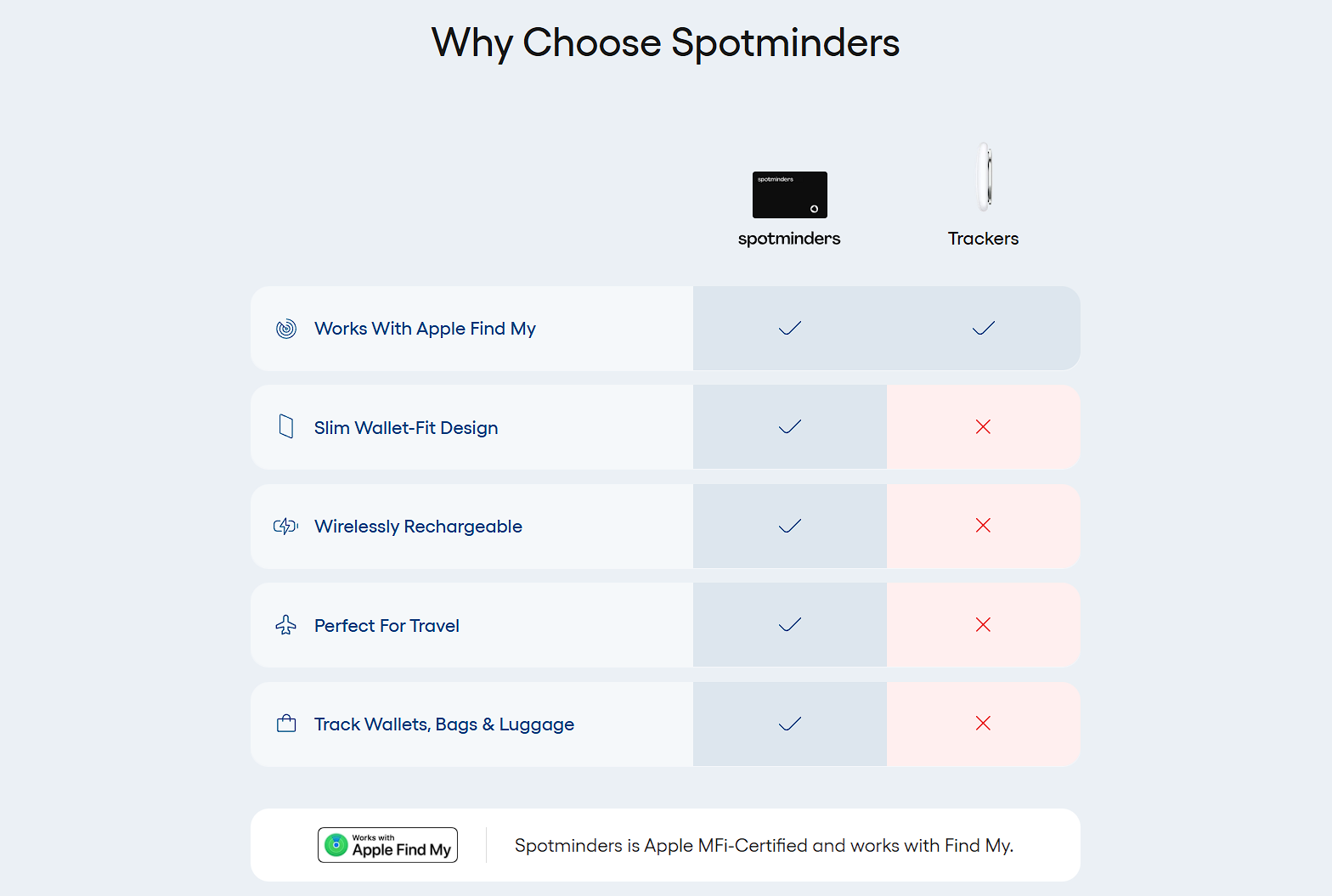
An example of a brand that shows this is Spotminders, selling tracking devices for everyday items like wallets and bags.
Their wallet tracking card page has a comparison chart that sets the product directly against general competitors, feature by feature. This allows visitors to see exactly what comes included with Spotminders and what’s missing from other options.
Nobody needs to hunt through spec sheets or decode marketing language across multiple websites. The chart handles that work in seconds, making the final choice much easier.
Product-Grid Messaging Highlights Key Buying Information
Product grids can include helpful information in addition to images and prices. Brief details placed directly within the grid can address customer questions and prevent uncertainty.
This information can contain financing and payment plans, packaging details, and customization options. It may also cover current inventory levels, brand details, and customer feedback such as reviews and user-generated content.
These details show up directly in the grid rather than on a separate page or in a pop-up window. This arrangement avoids interruptions to the browsing process. It allows shoppers to see relevant information while comparing products.
This approach can reduce the time from initial interest to purchase without adding extra clicks.
To apply this:
- Find the most common questions from customer support and reviews. These questions show what shoppers need to understand while browsing.
- Choose three or four of these points for each product category.
- Design small, uniform visual elements for them, like icons for financing or small badges for low stock.
- Place these blocks evenly across the product grid. This makes sure shoppers see new information as they scroll.
- Make sure the text is short enough to be read quickly.
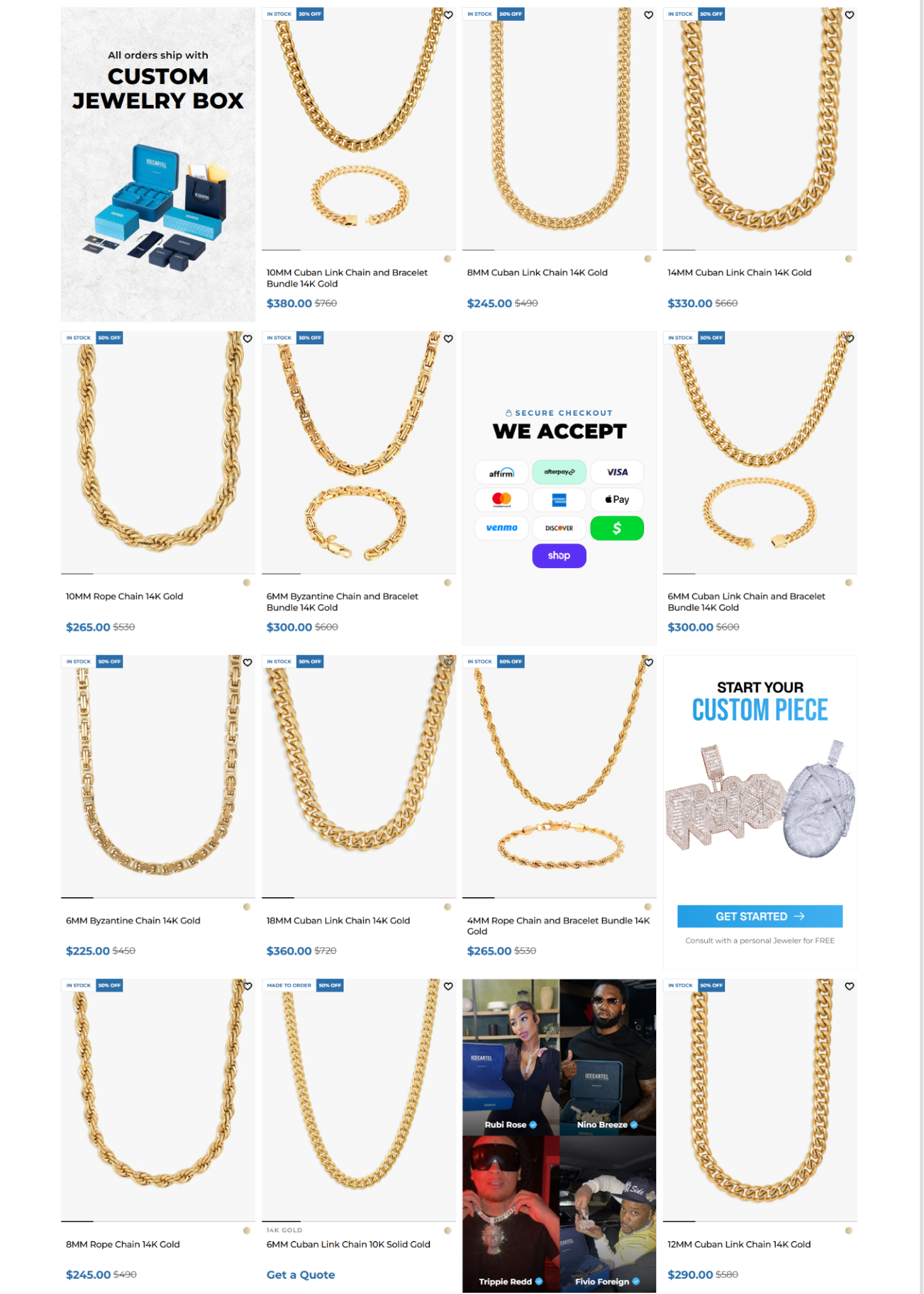
Icecartel, a men’s jewelry brand, implements this idea on its gold chains collections page.
Between rows of products, the page inserts blocks of information and visuals that show customization options, list payment methods, confirm that orders arrive in a custom jewelry box, and feature celebrities wearing the brand’s pieces.
This allows customers to pick up these details while comparing chains side by side, without leaving the page to search for answers elsewhere. That immediacy keeps momentum toward checkout.
Buying Guides Simplify Complex Purchase Decisions
Unfamiliar product categories make shoppers hesitate. These customers know they need something, yet they don’t understand the technical language or which specifications matter. They’re not sure which product fits their specific circumstances.
A buying guide helps here by giving a complete overview of a product category. It defines technical terms, explains the differences between high-quality and low-quality options, and shows which products meet specific requirements. This format lets shoppers find all needed information on a single page instead of searching through various reviews and forum discussions.
This kind of content works because it prioritizes education over sales. At the same time, it builds the confidence customers need before they spend money on unfamiliar products.
To create an effective buying guide:
- Pick a category where customers ask the most questions before buying.
- List all the information required for a user to make an informed choice, including definitions of key terms, relevant criteria, and how requirements change based on the use case.
- Structure the guide around specific scenarios instead of product features. This allows readers to go directly to the section that applies to their situation.
- Include links to specific products within the text. Place these links where the product addresses the problem being described.
- Keep the guide easy to find from category pages.
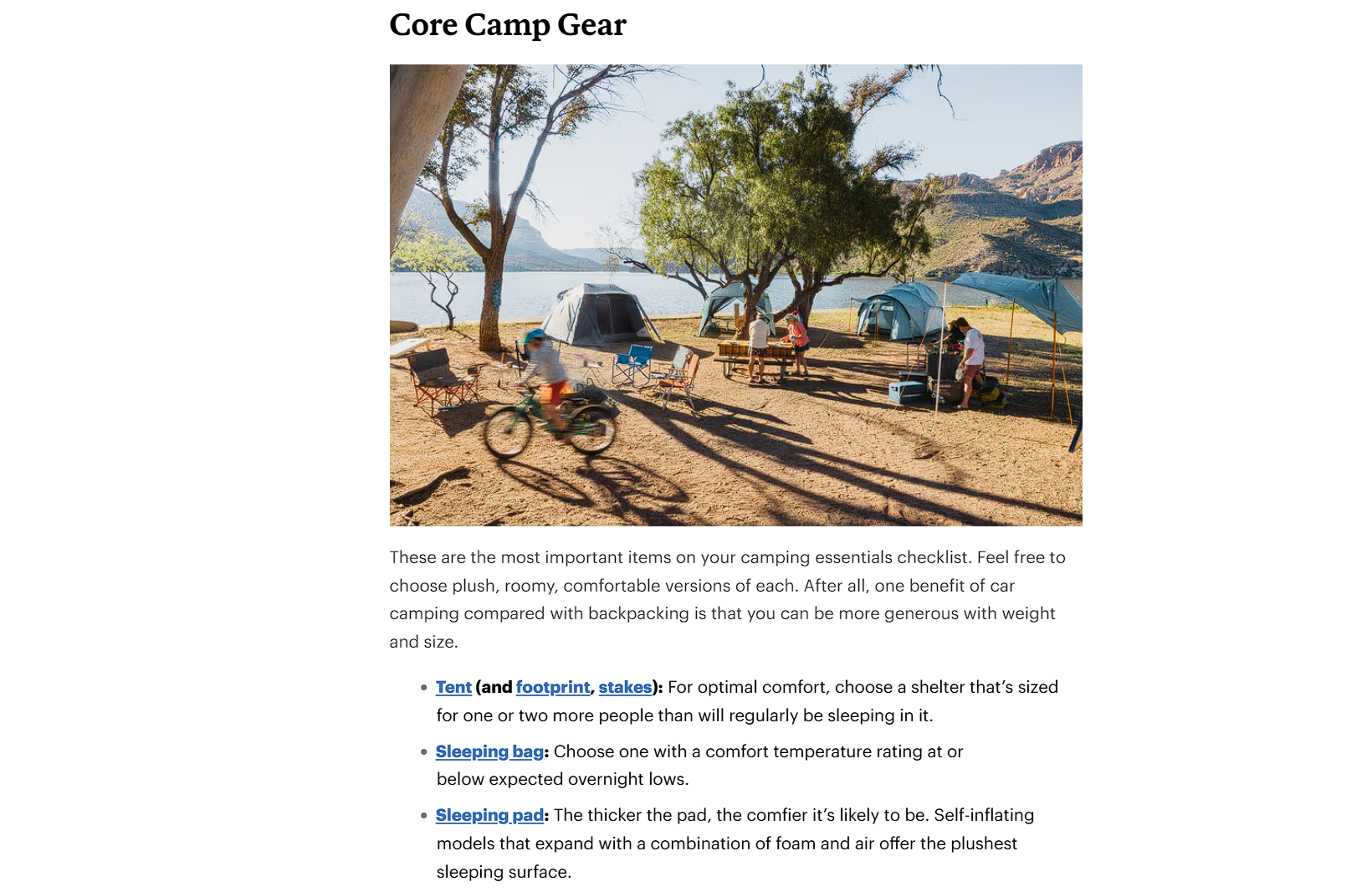
REI, a retailer offering outdoor gear and apparel, demonstrates this with its Camping Essentials Checklist.
The guide walks readers through tents, sleeping systems, cooking gear, and hygiene items, covering the full scope of what a trip requires. It links to related resources, like campfire tips and sleeping pad comparisons, keeping readers on the site longer.
What’s more, product mentions appear throughout, but they read as natural suggestions rather than promotional pushes.
Video Education Makes Complex Product Choices Easier to Understand
Some product details resist explanation through text alone. Compatibility questions, sizing charts, installation steps, and configuration settings often make more sense in motion than in a paragraph of instructions.
A short video placed right next to the relevant product lets shoppers watch the exact process instead of guessing how written steps translate to their own setup.
This matters more than most brands realize. When asked how they’d prefer to learn about a product, most customers point to video first, with 63% saying they’d rather watch a short clip than read a description. Placing that short video near the point of decision makes the whole choice much easier.
To implement video education:
- Identify the products that generate the greatest number of support inquiries about fit, setup, or compatibility. These items represent the greatest difficulty for customers.
- Keep each video to a length of two or three minutes.
- Focus each video on a single specific question rather than delivering a general product overview.
- Embed the video directly on the product page close to the relevant information.
- Avoid linking to an external video library.
- Add captions for silent viewing and keep it current as the product changes.
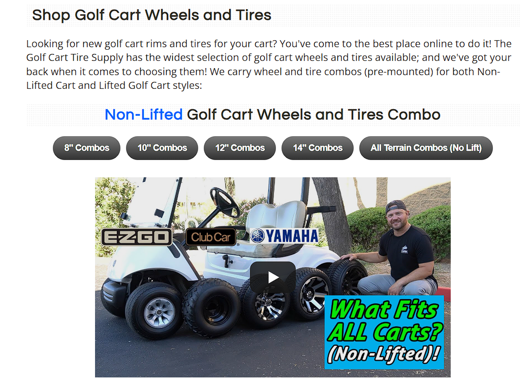
Golf Cart Tire Supply, a specialty retailer for golf cart tires and accessories, puts this to work on its golf cart wheels and tires page.
An embedded video explains exactly which wheel and tire sizes fit non-lifted carts, walking through the sizing logic step by step. In under two minutes, it delivers information that would otherwise take customers a long stretch of reading and cross-referencing to piece together.
Anyone unsure about fitment can watch this video once and order with full confidence.
Product Quizzes Make Product Education More Personalized
A product quiz turns a standard catalog into a short interactive experience. Instead of making customers examine many options on their own, it asks questions about their needs, preferences, habits, or circumstances, and then narrows the product list to a concise, relevant selection.
The benefit of this process goes beyond the final recommendation. The questions reveal to shoppers which aspects matter for their needs, whether that’s skin type, how often they use a product, or particular goals they might not have thought about.
When users arrive at the results page, they understand their own requirements more clearly. This makes the product suggestions appear purposeful rather than random. That builds trust in whatever the quiz recommends.
To build an effective product quiz:
- Limit it to fewer than ten questions.
- Each question should focus on a specific factor that alters the final recommendation.
- Avoid asking about general preferences that don’t impact the results.
- Use simple language instead of technical terms so that customers understand the purpose of every question.
- Position the quiz in a prominent location, such as the homepage or the main navigation menu, instead of placing it inside a blog post.
- When presenting the results, explain why each product was suggested rather than listing only the product names.
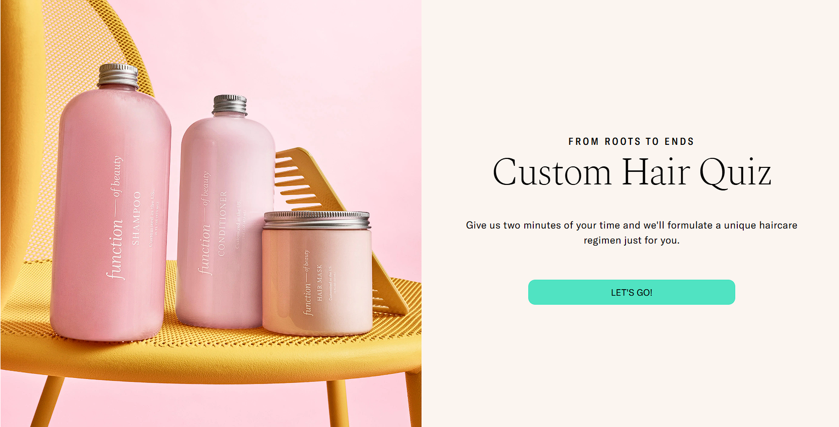
Function of Beauty, a brand built around custom-made hair and skincare formulas tailored to each customer, places its quiz right in the main navigation.
Answering a short set of questions takes about two minutes and results in a personalized haircare regimen built around the customer’s specific hair type and goals.
The questions stay narrow and purposeful, covering only the factors that genuinely affect formulation, like hair texture, scalp condition, and desired results, rather than cluttering the process with extra, unnecessary steps.
Final Thoughts
Product education turns browsing into confident buying.
Comparison tables can be used to clarify differences, grid messaging can answer questions while browsing, and buying guides can simplify complex categories. Videos can also demonstrate technical details, and quizzes can provide personalized recommendations. Each of these tactics helps shoppers understand the products and why the items meet their specific needs.
So, start with the method that solves your most significant customer problem. Then, track the outcomes and apply the process to other areas.
When you prioritize clarity over cleverness, you build trust that lasts beyond a single transaction.
Was this news helpful?
 Yes, great stuff!
 I’m not sure
 No, doesn’t relate