


Turning Browsers into Buyers: 5 Proven Tactics from Ecommerce Brands


Discover 5 proven tactics top ecommerce brands use to turn casual browsers into loyal buyers and improve conversions with practical, tested methods.
Most ecommerce owners obsess over traffic numbers. They celebrate when visits spike and panic when they dip.
But traffic alone doesn’t pay the bills. We’ve seen stores with 50,000 monthly visitors barely break even while others with 5,000 visitors pull in serious revenue. The difference is in the conversion rate.
Getting someone to click is easy compared to getting them to buy. Your visitors are distracted, skeptical, and one browser tab away from your competitor. They’re comparing prices, reading reviews, and looking for reasons to trust you. If your store doesn’t answer their doubts quickly, they’re gone.
The ecommerce brands that convert well don’t rely on luck or last-minute discounts. They build systems that quietly remove friction, answer hesitation, and make buying feel like the natural choice.
We’re going to show you five tactics they use, pulled from stores that actually move product. You can apply these approaches without rebuilding your entire store.
1. Earn Trust Through Social Proof
Shoppers make decisions based on what others have done before them. Long-standing studies confirm this: when people face uncertainty, they look to others’ actions to guide their own.
In ecommerce, this behavior drives the power of social proof. It shortens the decision process by signaling that others have already tested, approved, and valued what you offer.
To implement this:
- Place social proof where it helps customers at key decision points, such as on product pages, checkout screens, and homepages.
- Highlight verified reviews, user photos, or testimonials that address common doubts.
- Avoid generic praise. Focus on specific feedback that speaks to quality, delivery, or customer support.
- Show trust badges or recognizable client logos to strengthen credibility.
A brand that does this well is Mannequin Mall, a retailer selling fashion mannequins for brands and designers. On its homepage, the company includes a dedicated section for customer testimonials – real feedback from buyers who’ve used their products.
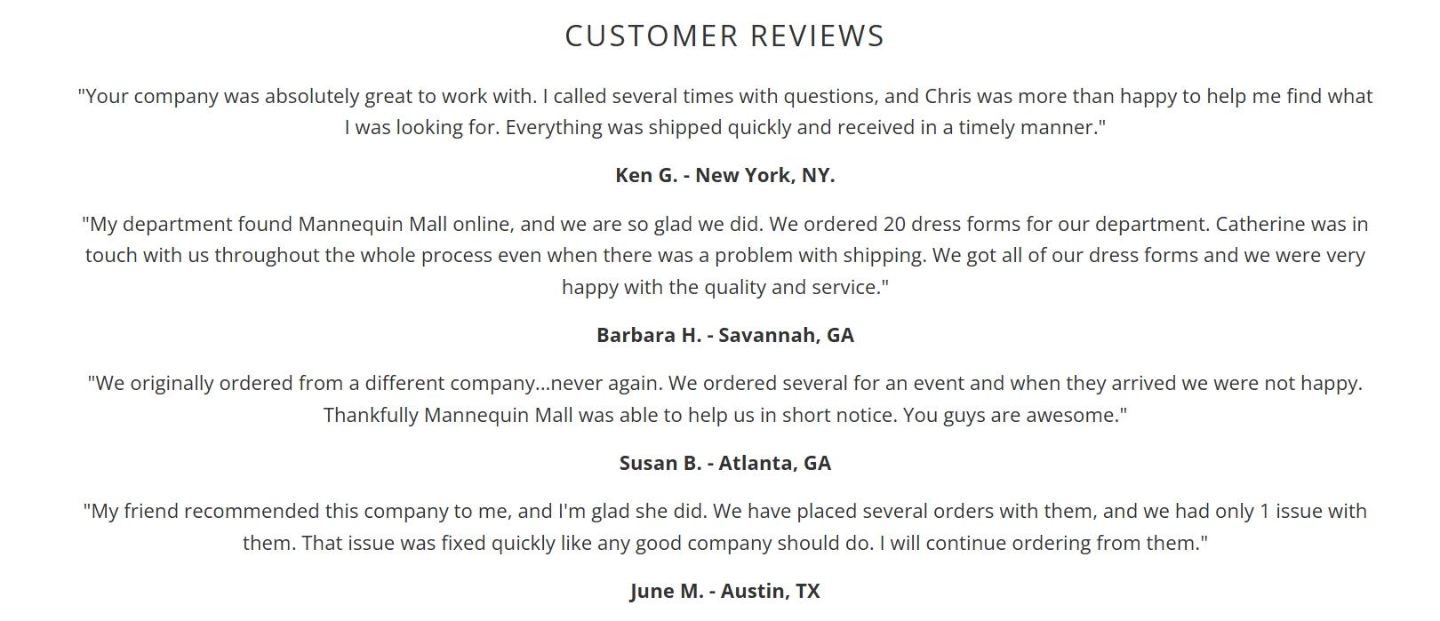
Source: mannequinmall.com
Just below that, Mannequin Mall showcases the logos of well-known clients like Nike, Gap, and Louis Vuitton. Those names instantly signal reliability and experience in their niche. Visitors don’t have to guess whether the brand is legitimate. The social proof does the work.
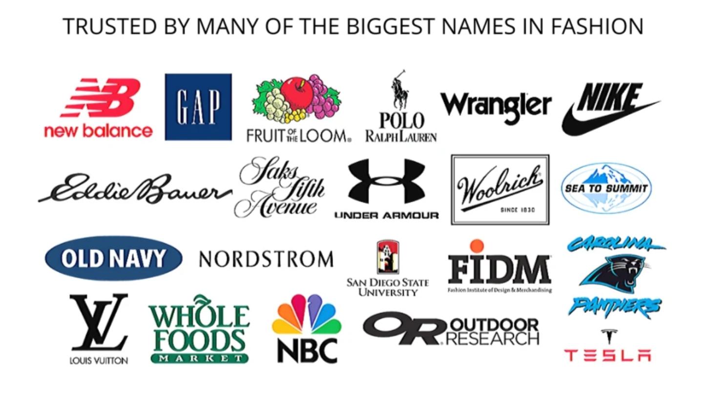
Source: mannequinmall.com
This mix of peer validation and brand association builds trust early, making it easier for visitors to take the next step with confidence.
2. Help Customers See What They’ll Get
Uncertainty is one of the biggest reasons people hesitate to buy online. When customers can’t touch or test a product, they rely on visuals to understand its value.
Clear, realistic imagery helps them imagine how the product fits into their own space or routine. When they can picture the end result, their confidence to buy increases.
To apply this well:
- Focus on clarity and context. Use high-quality photos or videos that show your product in real settings, not just studio shots.
- Include different angles, zoom options, and lifestyle images that show scale and use.
- Before-and-after visuals work especially well for transformation-based products, as they show the tangible difference your product makes.
- If you sell custom or high-ticket items, real-world examples are more persuasive than polished marketing renders.
EXT Cabinets, a company specializing in weatherproof outdoor kitchen cabinets, uses this approach effectively. On its homepage, visitors see a before-and-after visual of a customer’s backyard.
The “before” shows a plain outdoor space, while the “after” reveals a complete outdoor kitchen built with EXT Cabinets’ products.
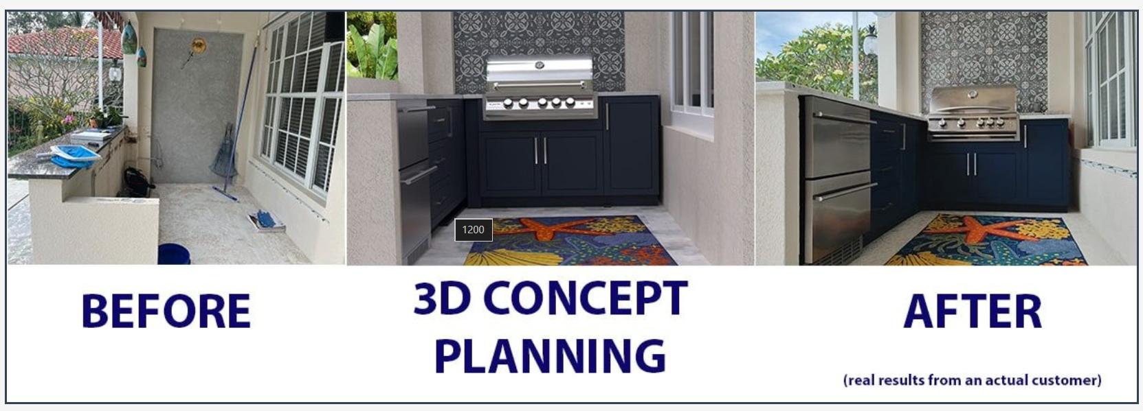
Source: extcabinets.com
This side-by-side view shows what’s possible without a single sales pitch. It gives visitors a clear sense of quality, design, and function, helping them connect the product to their own home.
The result is both emotional and practical validation, which moves people from browsing to seriously considering a purchase.
3. Incentivize Conversions with Generous Gifts
A well-timed incentive can turn hesitation into action. Research shows that 67% of consumers have made an unplanned purchase simply because they found a coupon or discount.
The psychology is simple. When people feel they’re getting added value or saving money, their resistance drops. For ecommerce brands, a thoughtful incentive can recover lost sales, collect emails, and strengthen customer relationships without devaluing the product.
To do this effectively:
- Pay attention to timing, relevance, and presentation.
- Avoid blanket discounts that train shoppers to wait for sales.
- Instead, use targeted offers that align with customer behavior.
- For example, trigger a discount when someone’s about to exit the site or has abandoned their cart.
- Keep the message concise and make the reward easy to claim.
- The offer should feel like a genuine gesture, not a desperate push for a sale.
A great example of this is Golf Cart Tire Supply, a leading supplier of golf cart tires and accessories.
When visitors move to leave the website, an exit-intent popup appears, offering 10% off their order. To receive the discount, users simply provide their email address and get the code sent directly to their inbox.
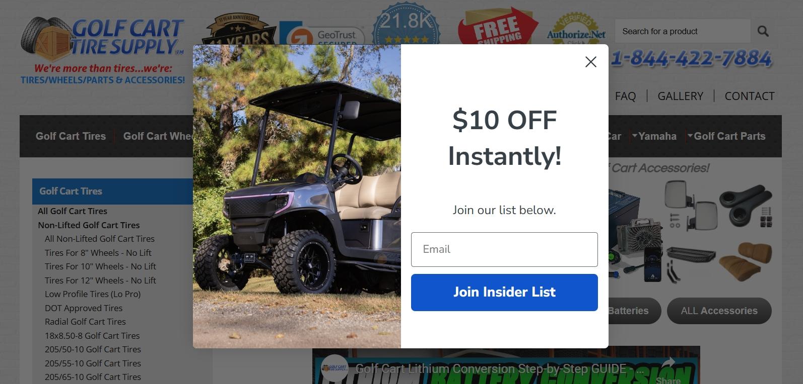
Source: golfcarttiresupply.com
This tactic works on two levels. It captures potential customers before they leave and builds the company’s email list for future engagement. The offer feels timely and rewarding, and for visitors who were on the fence, it’s often enough to turn browsing into buying.
4. Prioritize Simplicity and Minimal Design
Cluttered pages confuse customers and slow down their decisions. A simple, well-structured design removes distractions and helps people focus on what matters – understanding the product and completing their purchase.
Minimal layouts are proven to increase engagement and conversions because they reduce cognitive load, making navigation easier and the overall experience smoother. When users can find what they need without effort, they stay longer and buy faster.
To design for simplicity:
- Start with hierarchy. Every page should have one clear goal, whether it’s to explore products, add to cart, or check out.
- Use clean typography, balanced spacing, and consistent colors to create visual order.
- Avoid overcrowding your pages with popups, banners, or competing calls to action (CTAs).
- White space isn’t wasted space. It helps separate key sections so each element stands out.
- Test your layout on both desktop and mobile to make sure the experience stays fluid.
A strong example comes from Rituals, a beauty and cosmetics brand known for its calm, premium aesthetic. Their website uses generous white space to separate product sections and highlight each category.
The design feels organized and intentional. Nothing fights for attention, yet everything is easy to find. The layout naturally guides visitors toward their desired products without friction.
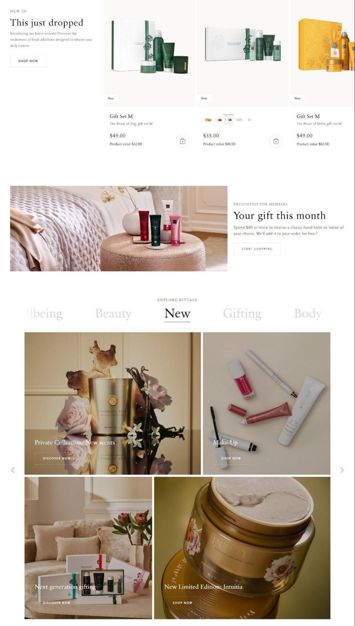
Source: rituals.com
This level of clarity reflects the brand’s identity and keeps users focused on exploring and purchasing. The brand shows how simplicity, when done right, helps create balance and make every detail serve a purpose.
5. Provide Instant Customer Support
Online shoppers expect quick answers. When questions go unanswered, hesitation grows, and so does the chance of losing the sale.
Customers genuinely value having chat support available at all times. It signals reliability and care. Instant communication removes uncertainty and gives people the confidence to complete their purchase or manage their subscription without frustration.
To do this right:
- Build a system that combines speed with quality.
- Live chat should be easy to find on every page, with clear operating hours if it’s not 24/7.
- Use automation for simple, repetitive tasks like tracking orders or updating account details.
- For more complex or sensitive issues, human support should step in quickly.
- Train your team to respond with accuracy and empathy, not scripted lines. A good chat experience can turn one-time buyers into loyal customers.
A standout example of this approach is HUM Nutrition, a brand offering subscription-based vitamins and supplements. Their website features an always-available live chat that manages everything from subscription cancellations to detailed product questions.
What makes their setup effective is how they blend automation with human interaction. Their chatbot handles routine requests such as cancellations and order updates, while human agents focus on pre-sale conversations about supplement combinations and personalized recommendations.
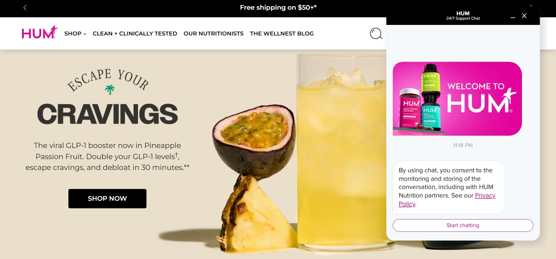
Source: humnutrition.com
This structure keeps response times fast without sacrificing depth or care. For customers, the experience feels seamless. The service is instant, helpful, and available whenever they need it.
Final Thoughts
The journey from a browser to a buyer is not a mystery. Ѕou can clearly map out this path with the right tactics. These five strategies can be your reliable starting points.
But keep in mind that the digital landscape is always shifting. What works today may evolve tomorrow. Always treat your online store as a living system that you constantly observe, test, and refine.
Your work now is to take one of these tactics and put it into practice. See what happens. Learn from the results, and then try the next thing. Stay curious, keep listening to your customers, and never stop optimizing.
Was this news helpful?
 Yes, great stuff!
 I’m not sure
 No, doesn’t relate