Icons8 delivers production-ready icons built for consistency, scalability, and real-world use across design systems, code, marketing, and education.
What Sets Icons8 Apart for Production Work
Icons8 is built like a system, not a flea market. Styles are named, metaphors repeat across sets, geometry is predictable, and new requests backfill coverage instead of adding chaos. Designers get pixel-fit art in multiple dialects. Developers get SVGs that behave with CSS, tooling, and accessibility. Marketers and educators can recolor and ship without redraws. The goal is not novelty, it is reproducibility across product UI, websites, docs, and courses.
Library Scope, Styles, and Coverage
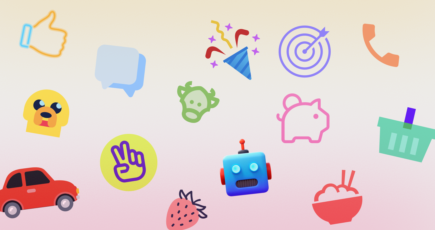
You can match platform norms or a brand voice without reillustration. Platform-native families mirror Apple and Google idioms, so iOS and Android screens feel culturally right. Systemic monochrome sets, outline and glyph and two tone, prioritize clarity at small sizes and in dense UI. Decorative families, Flat Color, Gradient, Doodle, Pastel, 3D Fluency, cover marketing pages, onboarding, and slides while staying internally consistent, so mixing still feels intentional. Animated icons ship in Lottie JSON, GIF, and sometimes APNG with motion that respects UI weight and timing. Specialized coverage spans fintech, logistics, healthcare, education, checkout flows, collaboration, and more, which cuts down on one offs. Search a common metaphor and you will usually find multiple style variants that keep you on brief.
Formats, Delivery, and Performance
SVG is the default for web and mobile, easy to recolor, animate, and compress with SVGO, friendly to React, React Native with SVG libraries, Android via VectorDrawable conversion, and iOS via PDF vectors or SVG wrappers. PNG is the safe choice for CMS, email, and slide decks when SVG rendering is unreliable. PDF, EPS, and ICNS or ICO handle desktop apps, installers, and document workflows. Lottie JSON and GIF cover motion without custom After Effects work.
Delivery fits real pipelines. Download and recolor in the browser, pull assets offline with the Pichon desktop app, or drop them straight into Figma with the plugin. Teams often add SVGs to component libraries and run a standard optimizer to keep payloads light. For performance, prefer inline SVG with a shared symbol sprite or a build step like SVGR. Skip icon fonts. They are heavier, harder to make accessible, and fussy to hint.
Design System Integration and Consistency
Pick one family per product tier, for example Outline for UI chrome, Two tone for empty states, Flat Color for marketing, and write it down. The shared stroke weights, radii, and optical alignment mean your tokens map cleanly. Stroke width can be standardized and nudged globally. Color tokens apply predictably in outline and glyph sets, with no gradient leaks. Size tokens like 16, 20, 24, 32 align to the optical sizes the sets were drawn for, so small controls stay readable. In Figma, publish an icon library with consistent frames and style variants. In code, convert SVGs into components and use semantic names that match your design tokens. That kills the one off import problem.
Editing and Customization Tools
The browser editor and companion tools handle the last mile. Recolor primary and secondary fills without artifacts, keep hierarchy in two tone while applying brand hues, and adjust stroke or corners to match softer or harder geometry. Add overlays like notifications or arrows without juggling layers in your design tool. Batch pull a subset in Pichon or the Figma plugin, recolor, rename, and export in one pass. If you ship code, export raw SVG and run SVGO to unify attributes and drop metadata. In Lunacy, Icons8’s free design app, search, place, and edit with vector tools and export for dev with a built in pipeline.
Developer Workflow: From Search to Shipping
Settle on a style, hand developers a named subset, then run every SVG through your optimizer. Wrap the result in a single Icon component. Drive color through CSS variables or props so dark mode becomes a one liner. Mark decorative icons aria hidden and give informative icons a clear label or title. Tree shake by importing only what you use. For legacy CMS or email, export PNGs at the exact sizes and skip runtime work. For motion, hand off Lottie JSON with names, durations, and easing that match your system. Lottie players exist for web and mobile, so implementation stays light.
Role-Specific Guidance and Use Cases
Designers: the geometry is consistent inside each style, so spacing, radii, and strokes feel authored, not stitched together. Audit duplicate metaphors and replace one offs with a single family. For empty states and onboarding, step up to a decorative set but keep the core metaphor identical to your UI icons, which creates a coherent story.
Developers: keep SVGs in source control and treat them like code. Normalize attributes, for example stroke set to currentColor where it applies, strip junk metadata, and lock a naming scheme. Route everything through one Icon component so you can measure, theme, and deprecate with confidence.
Design students: study how different styles communicate the same idea. Redraw a small subset and compare your curves and optical fixes against the Icons8 originals. You will see why specific angles and overshoots read better at 16 or 24 pixels.
Marketers and content managers: decorative sets cover blog headers, landing pages, and infographics fast. Recolor to your campaign palette and export crisp PNGs for email clients that mangle SVG. You get variety without drifting off brand.
Startups: pick one style, lock it in the brand guide, and list approved metaphors so the team does not improvise under pressure. Recolor to your palette, keep animated icons for real state change or wayfinding, and align durations across the product. This discipline keeps the look tight as you scale.
Educational projects and teachers: standardize one set for course materials, put it in a shared folder, and mandate consistent sizes and color tokens. Grading noise drops, and students absorb professional habits.
Emoji, Brand, and Specialized Sets
Icons8 ships emoji sets aligned with platform design languages. When you need Apple style pictograms for mocks, editorial, or platform specific decks, grab the curated iOS style collection here: iphone emoji download. Stay consistent with platform look and feel, iOS emoji in iOS docs and Android emoji in Android materials.
Brand and logo icons require care. Trademarks come with rules beyond icon licensing. Follow each brand’s guidance on color, clear space, and backgrounds. Icons8 provides vectors, compliance is on you.
Animated Icons and Motion Craft
Use motion to clarify feedback, not to decorate everything. Icons8 offers micro loops and one shots. For saving or sync, short loops with clear visibility at rest work best, and continuous animation in static views should be rare. Prefer Lottie for crispness and performance, keep GIF for email or places without Lottie support, and keep small state changes under about 800 milliseconds. Match easing curves to your design system so motion feels native to the product.
Accessibility and Internationalization
Icons must earn their place. Decorative ones are aria hidden. Informative ones carry a label such as Warning, Success, or Download and match the action text. Check color contrast for two tone icons if color communicates state, or back it up with text or shape. In RTL, pick metaphors that stay unambiguous and mirror directional icons where needed. Emoji in UI should have text alternatives for clarity and localization.
Licensing, Attribution, and Compliance
Free plans require attribution, paid plans remove it and widen commercial rights. Terms and included sizes or formats can change, so verify on the license page before release. Document whether attribution is required and where it lives, footer, credits page, or docs. Do not redistribute the set as a standalone asset library. Distinguish bundling inside an app from reselling assets. Note print, broadcast, or ad limits if they apply, and make sure your seats cover every designer and developer who touches the files. Clean licensing saves time with legal and procurement.
Limitations and Trade-Offs
Icons8 excels at systemic consistency. If you need a highly idiosyncratic, illustrator driven voice across every concept, a bespoke set may be better. Multicolor icons are harder to recolor programmatically than outlines or glyphs, so set brand colors at export rather than in CSS. Niche metaphors sometimes appear in one style before others, so perfect parity across all styles can lag for obscure topics. If you are locked to permissive open source only, validate plan terms or pair Icons8 with sets like Heroicons or Feather where policy demands it.
Comparisons: Where Icons8 Fits Relative to Alternatives
The Noun Project is unmatched for long tail metaphors because it aggregates many creators, but you will spend time enforcing consistency. Icons8 trades breadth for a coherent system you can ship as is.
Google’s Material Symbols and Apple’s SF Symbols are superb inside their ecosystems. They do not cover decorative or marketing needs, and their licenses are aimed at platform UI rather than general content. Icons8 bridges product UI and content with matching visual dialects.
Font Awesome grew up as a web font. Icon fonts add accessibility issues and scaling quirks. While Font Awesome offers SVG now, keeping outlined and filled styles consistent across product and marketing is trickier. Icons8’s families span both worlds with tighter internal rules.
Streamline is premium and meticulous. If you use it, you are in good hands. Icons8 matches the systemic rigor but layers in an ecosystem, Pichon, Figma, Lunacy, animated icons, and a wider decorative range.
Heroicons and Feather are excellent open source sets for startups. They are intentionally limited in scope and style. Icons8 becomes compelling when you need more styles, motion, and industry depth without hiring an illustrator.
A Practical Setup Checklist
- Choose one icon family for UI and one for marketing, and document allowed metaphors.
- Build a single Icon component, optimize SVGs with SVGO, and connect color to tokens.
- Publish a Figma icon library with fixed frames, size variants, and grid locked spacing.
- Enforce accessibility rules, aria hidden for decorative, labels for informative, and test small sizes.
- Define motion specs for animated icons, durations, easing, and use Lottie when possible.
Why Icons8 Works Across Teams and Contexts
A shippable icon system needs predictable geometry, synchronized coverage, last mile editing, developer friendly formats, and licensing that holds up in production. Icons8 handles those operational details while giving designers range and developers SVGs that theme, compress, and pass audits. With a clear style choice and light governance, naming, tokens, accessibility rules, it becomes quiet infrastructure that keeps your interface consistent and maintainable.
Was this news helpful?


 Yes, great stuff!
 I’m not sure
 No, doesn’t relate


