


10 Shopify Store Design Mistakes That Kill Conversions


Learn the 10 Shopify design mistakes that drive customers away and find practical fixes to improve clarity, speed, navigation, and overall conversions.
You can have the best product in the world and still watch your Shopify dashboard sit depressingly flat. Most of the time, this has nothing to do with bad traffic or being in the wrong niche, but is due to avoidable design decisions that quietly scare people away.
How a Shopify store looks is only a small part of the equation. What matters most of all is how easy it is to understand what you sell, whether you look trustworthy, and how many (or few) obstacles there are in the purchasing process.
When you think about Shopify web development, it’s easy to obsess over integrations and custom features. But the way your store is designed in terms of structure, layout, clarity, and speed, is what decides whether visitors ever make it to your cart in the first place.
Let’s walk through ten design mistakes that consistently kill conversions, plus some concrete fixes.
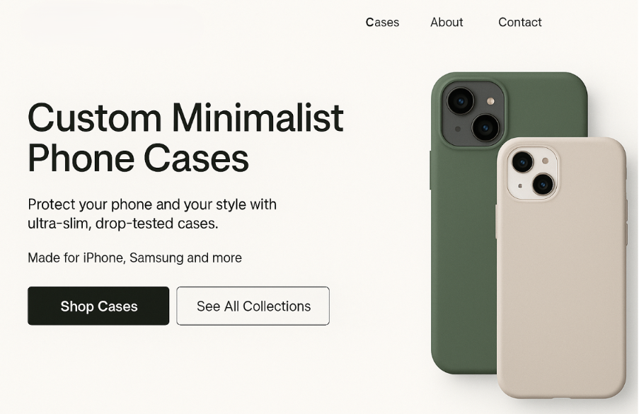
1. Unclear Hero Section
When someone lands on your homepage or a key collection page, you only have a couple of seconds to show what it’s about and why they should stay. Most struggling Shopify stores fail in this crucial task by wasting their above-the-fold space on vague taglines and generic lifestyle images.
If the visitor has to scroll and hunt to figure out what you sell, they’ll just leave. Stanford research found that about 46% of people say design is their number-one criterion for judging a company’s credibility, so a confusing or low-effort hero section means an instant drop in trust.
To fix this, add a clear headline that names the product or category, a short line of supporting copy focused on value, and a single primary call-to-action that’s impossible to miss:
2. Slow Pages That Punish Mobile Visitors
Google’s own research has found that around 53% of visits are likely to be abandoned if a mobile page takes longer than three seconds to load, and every extra second flushes more potential revenue down the drain.
So, focus on “fast” over “cinematic” by compressing product and hero images and using Shopify’s built-in image resizing and lazy loading where possible.
If you’re not sure where to start, run a PageSpeed Insights or Lighthouse test on your top 3 pages and fix the biggest issues, like large images, unused JavaScript, and render-blocking CSS, first.
3. Confusing Navigation
Searching and guessing feels like work, and nobody wants extra work just to buy a candle or hoodie, so if visitors can’t instantly see the path to the kind of thing they want, they bounce.
Common problems in this category include too many top-level menu items and important categories hiding in dropdowns or footers.
Use plain-language collection names people would actually search for, and limit top-level items to your main categories plus “About,” “Support,” and “Blog” if you use it. Also, your highest-margin or most popular category in a prime slot, and make Search obvious and usable with auto-suggest and typo tolerance.
4. Weak Visual Hierarchy
Typical signs of weak hierarchy include buttons that look like plain-text links and important messages like free shipping and returns, all buried in tiny footer text. If things are really bad, your product titles, prices, and CTAs are also all rendered with identical style and weight.
The point here is that important elements need to stand out; otherwise, the user has to consciously search for what to do next, and that extra cognitive load slows them down and makes drop-off more likely.
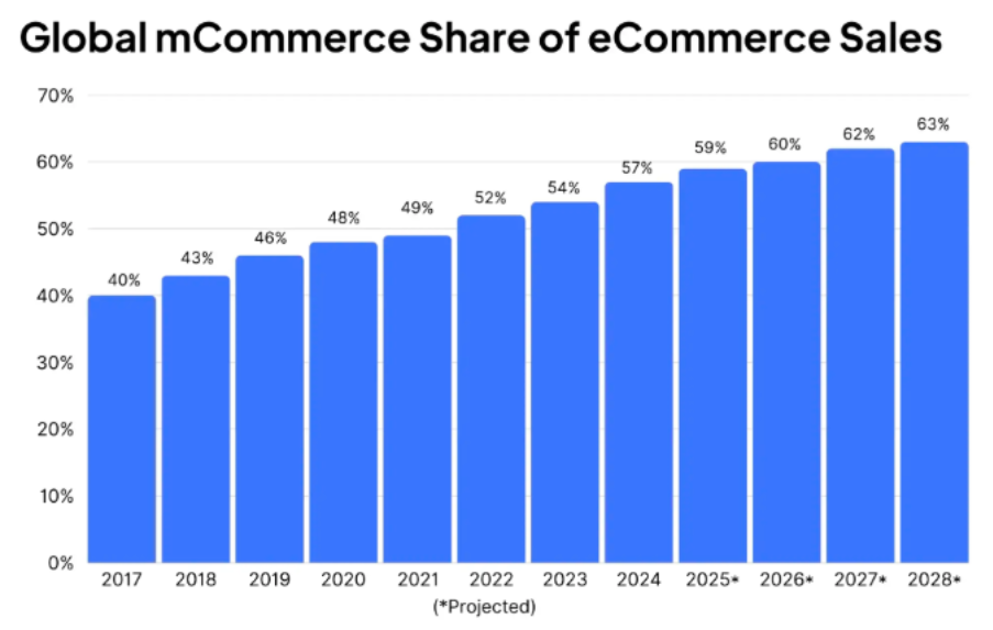
5. Ignoring Mobile-First Design
Recent data suggests that mobile commerce now accounts for well over half of global e-commerce sales, with some estimates putting m-commerce at around 60% of worldwide e-commerce revenue. That’s a problem if your store looks cramped and misaligned on mobile.
Small issues become deal-breakers on a phone, like tiny tap targets that are hard to click or forms that don’t fit on the screen.
Evaluate your store on an actual device, checking font sizes (aim for at least 16px body text), ensuring buttons and links have enough padding so they’re easy to tap, and removing anything that covers critical UI elements (like sticky banners over the cart icon).
6. Obnoxious Pop-Ups and App Overload
Overlapping pop-ups break the browsing flow and hide important content, while also slowing your pages down. Plus, when people have to close two things before they can even see your product, they feel manipulated rather than helped.
Measure the impact of each app on both speed and revenue. If an app adds complexity but doesn’t show up in your analytics as meaningful revenue, it’s a candidate for removal.
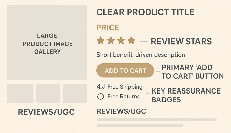
7. Product Pages That Don’t Reduce Risk
People don’t buy what they don’t understand or trust. If they’re unsure about what they’ll receive, how it fits, what it’s made from, or whether they can send it back, they’ll abandon. Product pages are where money is made or lost, so treat them with the appropriate amount of respect.
Think of your product page as a salesperson’s script, and write clear, concrete descriptions that answer what the product is, who it’s for, and what problem it solves. Also, add reviews and user-generated content close to the main product block, while repeating crucial reassurance messages about shipping times, returns, and warranty near the CTA:
8. Nasty Surprises at Checkout
When your store hides shipping costs or adds surprise fees at the last step, customers feel misled, and your conversion rate drops along with trust.
So, bring costs into the light early by showing estimated shipping costs or “From $X shipping” on product pages. If you offer free shipping above a threshold, make that extremely obvious near prices and CTAs, and avoid junk fees like the plague. In case you absolutely must charge something extra (e.g., fragile packing), explain why in plain language.
9. Forcing Account Creation
Forcing people to create an account before checkout is repeatedly cited as a top abandonment driver in cart usability studies. Every extra field is another chance for someone to think “I don’t have time for this,” and on mobile, cramped forms are even more frustrating.
You do need customer data. But you don’t need it all before they pay, so design your checkout for momentum.
10. Generic “Dropshippy” Design
If your store looks like a generic template with random stock photos and inconsistent branding, visitors subconsciously group you with every low-effort reseller they’ve seen. That makes them hesitant to trust you with their card details, especially if you sell higher-ticket items.
Choose a simple color palette and apply it consistently along with 1–2 typefaces across the site, with defined sizes and weights for headings, body text, and buttons. Then, replace obvious stock photos with brand-consistent imagery or UGC where possible.
Even a modest design cleanup like this can make your store feel like a real brand instead of a random template.
Was this news helpful?
 Yes, great stuff!
 I’m not sure
 No, doesn’t relate